The researcher’s guide to literature: Visualising crowd-sourced overviews of knowledge domains.
 Given
Giventhe enormous amount of new knowledge produced every day, keeping
up-to-date on all the literature is increasingly difficult. Peter Kraker
argues that visualizations could serve as universal guides to knowledge
domains. He and colleagues have come up with an interactive way of
automating the visualisations of entire fields along with relevant
articles. Through similarity measures identified in a Mendeley-powered
data-set, a researcher can see the intellectual structure of a field at a glance without performing countless searches.
 In Douglas Adam’s famous novel The Hitchhiker’s Guide to the Galaxy,
an unsuspecting man called Arthur Dent is lifted onto a spaceship just
before earth is demolished by intergalactic bureaucrats. Together with a
group of interstellar travellers (including amongst others the
President of the galaxy), he then embarks on a journey through the
universe to unravel the events that lead to the destruction of earth. To
help Arthur better understand the new surroundings he is thrown into,
he is handed a copy of The Hitchhiker’s Guide to the Galaxy, a multimedia guidebook that offers wisdom and advice on all topics of interest in the universe.
Starting out in a new scientific field can feel very similar: you are
faced with a new world that you have to make sense of. Unfortunately,
the knowledge needed to understand this new world is not readily
structured and summarized in one handy guide, but scattered over
millions of scientific articles. To make matters worse, you have no idea
which articles belong to the field that you are interested in and which
of them are actually important. For many researchers, the starting
point in their quest to conquer an unfamiliar knowledge domain is to
turn to their personal favourite search engine, type in the name of the
field of interest and start reading at the top of the list. Once you
have read through the first few articles (usually highly cited review
articles), and followed relevant references, you develop an idea of
important journals and authors in the field and adapt your search
strategy accordingly. With time and patience, a researcher can thus
build a mental model of a field.
The problem with this strategy is that it can take weeks, if not
months before this mental model emerges. Indeed, in many PhD programs,
the first year is devoted to catching up with the state-of-the-art.
There is also a lot of reading and summarizing involved, but searching
for relevant literature usually accounts for a large chunk of the time.
And even with the most thorough search strategy, the probability that
you are going to miss out on an important piece of prior work is rather
high.
Another means of getting an overview a research field are knowledge
domain visualizations. An example for such a visualization is given
above. Knowledge domain visualizations show the main areas in a field,
and assign relevant articles to these main areas. Hence, an interested
researcher can see the intellectual structure of a field at a glance
without performing countless searches with all different sorts of
queries. An additional characteristic of knowledge domain visualizations
is that areas of a similar subject are positioned closer to each other
than areas of an unrelated subject. In the example “Pedagogical models”
is subject-wise closer to “Virtual learning environments” than
“Psychological theories”. Thus it is easy to find related areas to one’s
own interests. Granted, even with a knowledge domain visualization in
hand, you would still need to do the reading. But it would certainly
save you a lot of time that you would otherwise spend on searching,
indexing and structuring.
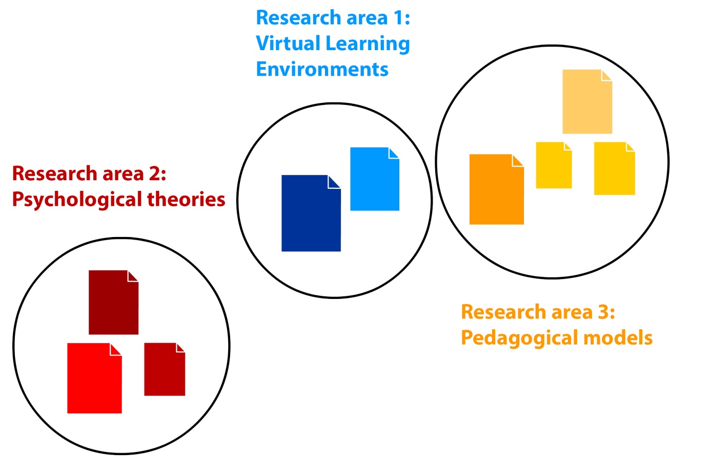 Image credit: Maxi Schramm. Public domain.
Knowledge domain visualizations can not only be created on the level of the individual research article. Below you can see a visualization by
Bollen et al. (2009) of all of science. The nodes in the network
represent research journals and the different colors designate different
disciplines. Even though the idea of knowledge domain visualizations
has been around for quite some time, and despite their obvious
usefulness, they are not yet widely available. Part of the reason may be
that in the past, the data needed to construct these visualizations was
only available from a few rather expensive choices. Part of the reason
may be that there has been an emphasis on all-encompassing overviews.
While they provide valuable insights into the structure of science as a
whole, they are usually not interactive and provide little value in
day-to-day work where you want to be able to zoom into specific
publications. There are several applications out there that can be used
to create one’s own overview, but they can usually only be operated by
users that are information visualization specialists.
 Image
Image
credit: Bollen J, Van de Sompel H, Hagberg A, Bettencourt L, Chute R,
et al. (2009) Clickstream Data Yields High-Resolution Maps of Science.
PLoS ONE 4(3): e4803. Creative Commons Attribution 3.0 Unported.
In our work, we therefore aimed at creating an interactive visualization that can be used by anyone. As a first case, we chose to
visualize the field of educational technology, as it represents a highly
dynamic and interdisciplinary research field. As described in a
recently published paper in the Journal of Informetrics (Kraker et al 2015),
the visualization is based on a novel data source – the online
reference management software Mendeley. The articles for the
visualization were selected from Mendeley’s research catalog which is
crowd-sourced from over 2.5 million users from around the world and
offers structured access to more than a 100 million papers.
One of the most important steps when creating a knowledge domain
visualization is to decide which measure defines the similarity between
two articles. The measure determines where an article gets placed on the
map and how it is related to other articles. Again, we used Mendeley
data to tackle this issue. Specifically, we used co-readership
information. “So what is this co-readership exactly?” you may ask.
Mendeley enables users to store their references in a personal library
and share them with other people. The number of times an article has
been added to user libraries is commonly referred to as the number of
readers, or in short readership. In analogy to that, we are talking
about the co-readership of documents, when they are added to the same
user library. When Alice adds Paper 1 and Paper 2 to her user library,
the co-readership of these two documents is 1. When Bill adds the same
two papers, the co-readership count goes up to 2, and so on. Our
assumption was now that the higher the co-readership of two documents,
the more likely they are of the same or a similar subject. It’s not
unlike two books that are often rented together from a library – there
is a good chance that they address related topics. And indeed, our first
analyses indicate that our assumption is valid.
The cool thing is that once you have settled on a similarity measure,
the process of creating the map can be highly automated. We adapted
procedures for assigning papers to research areas and for situating them
on the map. We also put a heuristic in place that tries to guess a name
for each area using web-based text mining systems OpenCalais and
Zemanta.
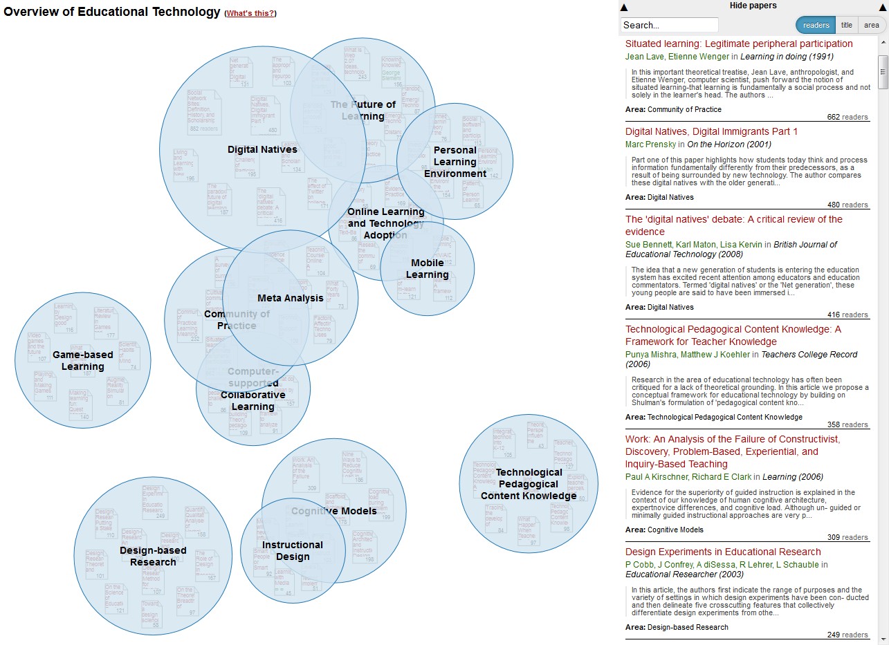
The resulting knowledge domain visualization can be seen below. The
blue bubbles represent the main areas in the field. The size of the
bubbles signifies the number of readers of publications in that area.
The closer two areas are in the visualization, the closer they are
subject-wise. An interactive version is also available; once you click
on a bubble, you are presented with popular papers in that area. The
dropdown on the right displays the same data in list form. Just go to
Mendeley Labs (http://labs.mendeley.com/headstart) and try it for yourself! The source code is available on github: http://github.com/pkraker/Headstart
Apart from the fact that you can get a quick overview of a field,
there are many other interesting things that you can learn about a
domain from such a visualization. Fisichella and his colleagues even
argue that mappings like the one above might help to overcome the
fragmentation in educational technology by building awareness among
researchers of the different sub-communities. There may be some truth to
this assumption: when I evaluated the map with researchers from
computer science, they discovered research areas that they did not know
existed. One example is Technological Pedagogical Content Knowledge,
which is a conceptual framework emanating from the educational part of
the research community.
Another interesting possibility is to study the development of fields
over time [1]. When I compared the map to similar maps based on older
literature (e.g. Cho et al. 2012),
I learned a lot about the development of the field. Whereas learning
environments played an important role in the 2000s, issues relating to
them have later split up into different areas (e.g. Personal Learning
Environments, Game-based Learning). You can find further examples in the
paper describing the full details of the evaluation which still under
review. You can find a pre-print on arXiv.
Given the enormous amount of new knowledge that is produced each and
every day, the need for better ways of gaining – and keeping – an
overview is becoming more and more apparent. I think that visualizations
based on co-readership structures could provide this overview and serve
as universal up-to-date guides to knowledge domains. There are still
several things that need fixing – the automated procedure for example is
not perfect and still requires manual interventions. Furthermore, the
characteristics of the users have a certain influence on the result, and
we need to figure out a way to make users aware of this inherent bias.
Therefore, we are currently working on improving automatization
techniques. Algorithms, however, will never be correct 100% of the time,
which is why we are also experimenting with collaborative models to
refine and extend the visualizations. After all, an automated overview
can never be the end product, but rather a starting point to discovery.
[1] Educational technology experts will notice that some of the
newest developments in the field such as MOOCs or learning analytics are
missing from the overview. That is due to the fact that the data for
this prototype was sourced in August 2012 and is therefore almost 2,5
years old. The evaluation was conducted in the first half of 2013.
Note: This article gives the views of the author, and not the position of the Impact of Social Science blog, nor of the London School
of Economics. Please review our Comments Policy if you have any concerns on posting a comment below.
About the Author
Peter Kraker is a researcher at Know-Center (http://know-center.at) of Graz University of Technology and a 2013/14 Panton Fellow (http://pantonprinciples.org/panton-fellowships/).
His main research interests are visualizations based on scholarly
communication on the web, open science, and altmetrics. Peter is an open
science advocate collaborating with the Open Knowledge Foundation (http://science.okfn.org/) and the Open Access Network Austria (http://oana.at/en/home/).

Impact of Social Sciences – The researcher’s guide to literature: Visualising crowd-sourced overviews of knowledge domains.
No comments:
Post a Comment