Source: https://blogs.unimelb.edu.au/23researchthings/2020/08/05/thing-16-data-visualisation/

Thing 16: Data Visualisation
Data visualisations can be a powerful way of synthesising your research and representing it in a way that’s understandable. Visualisations may take the form of charts or graphs, diagrams, images, animations, or infographics. They can be effective for communicating complex research, even to a non-expert audience. In this post, Gene Melzack introduces data visualisation as a way to make your research more accessible.
Getting started
Data visualisation is closely tied to data analysis. You may want to perform some preliminary visualisations at the start of your analysis, as a way of getting to know the data and deciding what analysis methods to use (also known as ‘exploratory data analysis’). Research workflows may involve receiving updates to data or refining your analysis, which means you’ll need to update your visualisation in turn. If you can do all this with a single tool that handles both analysis and visualisation in one, it will streamline your workflow. Consider data visualisation capabilities when selecting a data analysis tool, as it could save you time and hassle later – even if it means initially choosing a tool with a steeper learning curve.
Considerations
Before you dive in and choose a visualisation tool, you’ll need to consider the following points:
Audience
Is the visualisation a ‘quick and dirty’ one just for you, or is it for communicating your research to peers in the scholarly community, or to the public? This may influence whether you choose a simple or more complex visualisation.
Data
Different types of visualisation suit different types of data. With so many options available, choosing the right visualisation style can seem overwhelming. For example, do you want to go with a network diagram or a bubble map? Or maybe a boxplot, or a cluster analysis?
The Data Visualisation Catalogue allows you to explore not only style, but also specific functions. Other great sites for inspiration are the Data Viz Project and From Data to Viz. Just ensure you choose a visualisation that communicates the message of your data effectively.
Format
Is the visualisation for a conference presentation, journal article, or an interactive web visualisation? This will affect how the visualisation is displayed: in print or online, static or active, in colour or grayscale.
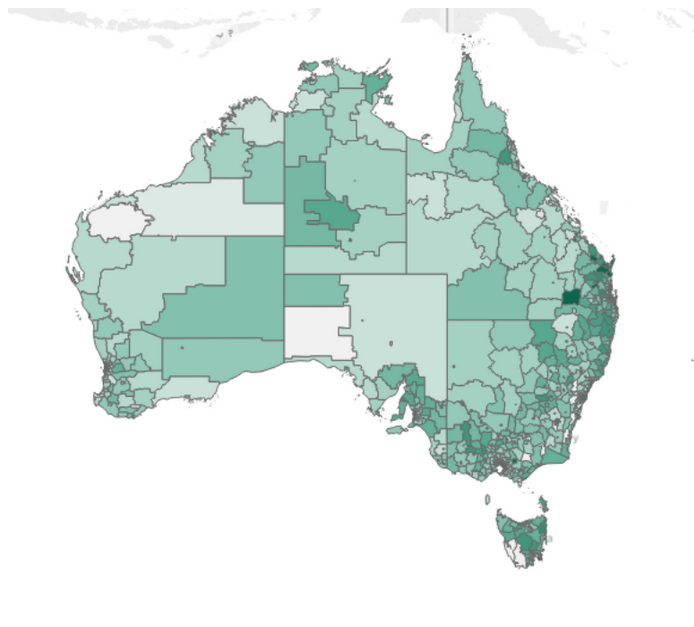
For an example of data visualisation in practice, click on the image below to explore an interactive map of Census data:
Tools
We’ve already established that, in most cases, the best approach is to visualise your data with the same tool you use for your data analysis. For example, if you analyse your data with MATLAB, consider using the inbuilt graphics functions for visualisation. Or if you use NVivo for data analysis, explore its visualisation options for Windows and Mac.
If you use scripting languages such as R or Python for data analysis, then there are a variety of packages or libraries you could choose. Here are some that come recommended by researchers who specialise in data analysis and visualisation:
- Seaborn. A data visualisation library for Python, based on matplotlib.
- Plotly. An interactive graphing library for Python; also available as libraries for JavaScript and R.
- ggplot2. R package for creating graphics from the tidyverse. Integrates with Plotly.
Learn more
The University of Melbourne’s Statistical Consulting Centre provide advice on visualisation good practice. Have a look at these five principles of good graphs, and find out why you shouldn’t use pie-charts.
Do you want to develop your visualisation skills? Access online trainings, self-paced tutorials, and e-learning videos with the Research Computing Services’ Digital Research Skills Support Pack. Or check out the Researcher@Library session on ‘How to Create Research Impact with Data Visualisation and Infographics’.
About the author
Gene Melzack is a Data Steward with the Digital Stewardship (Research) team. He works closely with the Research Data Specialists from the Melbourne Data Analytics Platform (MDAP), who provided expert data analysis and visualisation advice in the writing of this post.
Want more from 23 Research Things? Sign up to our mailing list to never miss a post.
Image available from https://plos.figshare.com/articles/A_Portrait_of_the_Transcriptome_of_the_Neglected_Trematode_em_Fasciola_gigantica_em_Biological_and_Biotechnological_Implications/139122 under a CC BY 4.0 license (created using iPath)
No comments:
Post a Comment